Resources for photographers
Hi. I'm Linnae Harris, web designer & photographer. I help photographers make magnetic websites that attract their ideal peeps.
First impression of photography website – make it a good one
Your first impression of your photography website is everything!
Think about it. Even if your prospective client first found you on social media or in person, your website is the first time your client is in a space totally influenced by you- no outside distractions!
However, even though a potential client is on your page, it doesn’t mean you have their attention.
In fact, you probably only have 5-7 seconds to grab their interest before they move on.
So how do you ensure you capture their attention in the short time you have it?
Put your very best work “above the fold” of your page.
And I don’t just mean your best photography.
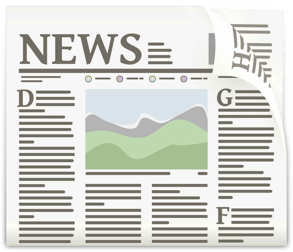
If you’re not sure what I’m talking about, “above the fold” is a term going back to when newspapers were prevalent and refers to the section on the front page that would usually be seen from the top of the newspaper pile. Normally, it was the only part you would see before deciding whether or not you wanted to buy it. Not surprisingly, newspapers dedicated this space to whatever they thought would seize the most attention and make someone want to read the rest.

Sound familiar?
For you, it’s the space on your website that someone would see before having to scroll down.
Believe it or not, 35% of viewers will leave your website before touching the scroll button at all!
This is why it’s so important to have a professionally designed website that puts your best foot forward at the very first glance.
The best way to do this can be narrowed down in 2 words:
BE CLEAR
Clarity can be found (or lost!) in a few ways.
1) Use a strong and compelling headline
Remember, your number #1 goal is to show a potential client exactly how you can be their “hero” and “save” them from any problems they may have.
If you haven’t come up with your branding statement yet, I’d advise you start HERE as it’s what should guide you throughout your site and marketing.
Once you have your brand statement, coming up with your main headline should be pretty straightforward.
It should let a reader know: what you do, who you do it for, where you do it (if a local business), and how you do it differently (even if it’s just a hint!)
Here are some examples I’ve used in websites:
“A grand adventure is about to begin. Let me tell your child’s birth story with fine art photography”. Columbia Newborn Photography
“Photography for men who don’t want to be photographed (but who need photos for their business)” Tampa Headshot and Branding Photographer
“Branding photography for women who lead with their heart and who want to change the world- one project at a time.”
Nashville Branding Photography
If you notice, all of these included what would have likely been the photographer’s brand statement followed by an additional headline designed to specifically highlight their main SEO key phrase.
The most common way to do this is “Your city, your niche, photography or photographer”
This can be used as a subhead of your main headline or can be positioned in another location at the top of your page by tagging it “H1” so Google knows to prioritize it as your main keyword phrase in its rankings.
2) The right imagery
As a photographer, I don’t have to tell you how important the right image can be. Now, you just have to decide on the best way to present it.
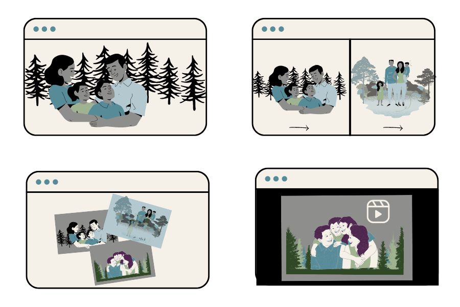
The most common above the fold image options are: a large hero image, a slide show, a collage or a video.

Whichever you choose, make sure it represents not only your very best work but also what you want to be hired for. This should be common sense, but you’d be surprised how many photographers fall in love with a photo and use it everywhere – even if the style isn’t relevant to what they do anymore.
Remember, you’re not just looking for a good image, you’re looking for the right image(s) to compliment your brand.
3) Usability
Have you ever visited a website that contained an error right when you looked at it? A video that won’t load… a sentence that doesn’t make sense… a paragraph or photo cut off and hard to view in its entirety on your screen?
How turned off were you? If it was a website you had to stay on, I’m willing to bet you grumbled about it and just tried to get what you needed and moved on. If it was a website you were just casually looking at, you probably quickly left it and forgot about it.
That’s a major error on any website, but on a photography website?! EEK!!!
You can pick the very best photographs and come up with the perfect wording, but if a prospective client can’t see it in the way it is intended, you’ve lost the impact you tried so hard to achieve.
Make sure you size and optimize your images and videos properly so that they will load easily.
Google will penalize your site’s rankings if your pages load too slow.
Don’t be a victim of a poor quality website or design.
This is just one of a myriad of ways a professional web designer can ensure you have the best website to enhance your business.
A good first impression can make or break you.
Your above-the-fold website content directly impacts your engagement metrics, because if properly optimized, you’ll likely see a decrease in bounce rate and an increase in conversions.
A successful home page with a great first impression will instantly show your audience what you’re about, will be clear and concise, will showcase your best photography and last, the site will load quickly. This will draw your potential client in and will inspire them to explore the rest of your website and its offerings.
Make a great first impression of your photography website. Create a clear picture of how you can be THE photographer your potential client needs right from the start and set yourself up as their #1 choice to get the job done.
Reach out to me now for a website critique, strategy consult or to discuss a brand new custom site.

Leave a Reply
Enter your name and email address and viola - you'll have your guide on how to improve your SEO with backlinks! Includes 150 free places to acquire backlinks.
Great blog! Very insightful and I really appreciate your examples of compelling headlines. I will definitely try and think of ways to make my headlines stronger. Thank you for sharing!
Lots of helpful information, will be reviewing my site, which is a constant evolution
Great suggestions for improving a website. I’ll be testing my own site to make sure that everything works as it should.