Resources for photographers
Hi. I'm Linnae Harris, web designer & photographer. I help photographers make magnetic websites that attract their ideal peeps.
How to create a successful “About me” page
No matter the type of business, it seems every website has its own version of an “About Me” or “About Us” subpage.
Of course, when you think about it, it makes complete sense. You need a place to tell your story and highlight all the skills you have that make you better and sets you apart from your competition.
This comprehensive guide for photographers will show you how to create a successful About me page.
The purpose of your photography About Me page
What you may not know, is that writing an About Us page is much more than just coming up with a creative way to introduce yourself to potential clients.
In fact, it’s actually not even about you.
“What?!”
Shocking, I know.
Just like your homepage however, the entire purpose of an About Us page is to convert reader’s into clients.
That’s it.
So how exactly do you create a successful About Us page that will result in more sales?
Read On…
What to write in an About Us page
Because of its title, people often use their “About me” or “About us” page as the place to wax poetic about how wonderful and successful they are.
After all, isn’t that what the name says to do?!
Unfortunately, all the “me, me, me” talk can come across as narcissistic and boring.
I don’t know what’s worse: Reading through someone’s detailed description of why they’re great or planning to work with someone who seems like they focused solely on how wonderful they are.
There’s a reason why so many 1st date horror stories talk about having to sit through a meal with someone who spends the entire time just talking about themselves- don’t be the business version of that guy/girl.
The only reason a client really wants to know about you, is to see how they can use your awesomeness to help them.
Basically, you need to figure out what your client needs/wants are or their “pain points” and turn it around to show them how who you are will help them achieve their goals and solve their problems.
That’s the only part of you they really care about and need to know.
At this point you may be thinking: “It’s called an “About Me” page! How am I supposed to write about myself and NOT sound narcissistic?!”
Luckily, it’s not that hard once you figure it out.
Here are two prime examples for you to look at:
“I’m PPA Certified.” vs “I’m certified by one of the largest photography organizations, PPA, which means that I’m knowledgeable, and technically-equipped and will be providing you with heirloom photographs of the highest standards.
In the first sentence, a reader will likely just gloss over the statement or possibly even not know what it means. “PPA what?!” or “Yes, you and the other 5 people I’ve looked up.”
With the second sentence, you are not only listing your skill, but also directly pointing out how it helps them- even if they may not know what the skill is. “Yes! I want a photographer that is certified”
I wrote this on my “About me” page. “I’m a photographer with a knack for design and business. Trust me, not all web developers know anything about composition and design, or how to make a site that converts viewers into clients. While I’m a creative mind with over 30 years in art, design and photography, my true strength lies in planning and strategizing.”
The goal is not to just go on about how great you are, but to show your potential client how your skill can directly benefit THEM.
Remember, they only care about how your amazing talent can get them what they want and the results they are looking for.
Basically, view your “About Me” page as an “About me and what I can do that will help YOU” page. Turn the “Me, me, me” talk into “you, you, you.”
With that manta in your brain, you can move on to the other fundamentals:

Remind the reader that there is a person behind the business.
Unlike other sections of your website, this is where you should be a little more informal and friendly.
Get personal.
Sneak in bits about yourself that give a glimpse of who you are.
This is where you are free to let loose a bit and pass on the information you feel a client should know about you in a way that is fun to read.
Think of the difference between reading a fun blog vs a resume.
You’re selling your photography, not refrigerators. You want to do everything you can to make the reader feel connected and get them emotionally invested in you and your business.
What are the most interesting stories about yourself? Listing that you’re obsessed with coffee isn’t nearly as exciting as telling your audience that you led local parades twirling a baton when you were a child – yep that’s me! I wore my sparkly costumes and danced in front of a crowd and had very little fear. Nowadays, being in front of a crowd would terrify me!
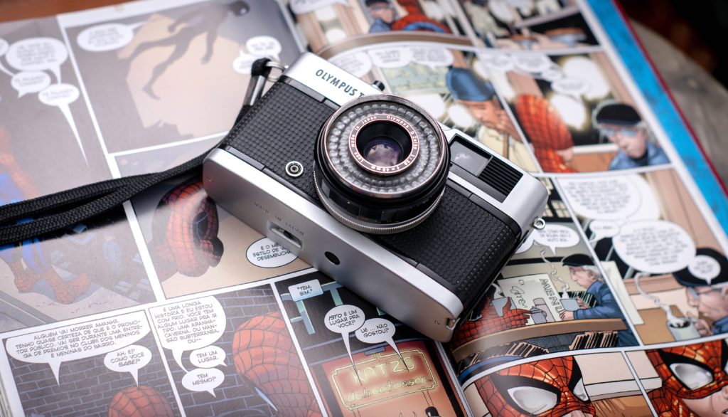
Perhaps you’re a comic book junkie with a first edition and a 500 issue collection of Spiderman…..I would enjoy reading about that obsession!

Use a self portrait
It’s hard to form a connection with someone you’ve never seen before, so give potential clients a face to go with your business.
When a potential client is able to literally “see the person behind the lens,” you automatically add a level of trust to your relationship.
Are you focusing on professional, high end clients? A moody, black and white photo of yourself may fit the vibe you’re going for perfectly.
Are you a family photographer who wants to show just how energetic and fun you are? Think outside the box and give them something that makes an impact.
As a photographer, you should feel free to get as creative as you wish and use this as a way to get your personality across.
Having an artistic block? Look here if you need some fun and creative self portrait ideas:


Tell a story
Is there a quicker way to make an emotional connection with someone than to tell them something personal about yourself?
I’m not saying you should write a full biography, but if you have a story which can help your clients relate to you- use it!!!
Maybe you started off as a newborn photographer, but then when you had your own wedding you were left unsatisfied with the options available. Because of this, you have a passion for wedding photography and ensuring other couples get the wedding photos of their dreams.
Ta-da! You now have a nice story AND a great pitch.
If you’ve followed any of my previous articles, you know I feel strongly about telling a story through your website. It is one of the best ways to grab a potential client’s emotions and there’s no easier place to do it than in your About Me page!

Tell why you’re different and back it up
Consider this an additional tool to reinforce the “what I can do for you” mindset.
Add specific details that set you apart from your competition.
“Unlike most photographers, I have equipment that allows me to shoot comfortably in the rain”, “I offer discounts for clients who refer me to their friends”, or “I’m bilingual and speak both English and Spanish.”
More than likely, your About Me page isn’t the first one a potential client has read. You need to give them a practical reason to put you ahead of the competition.
Find the qualities that make you unique and sell them!
Optimize for SEO
In the simplest terms, SEO (or Search Engine Optimization) keywords are the words and phrases used to make sure your website comes out on top.
While it may be in your best interest to hire an SEO expert to help you do everything needed to get your website at that #1 spot, there are a couple things you can do on your own which can help.
The biggest is to come up with the phrases you think potential clients will use in a search engine to find you and make sure you insert them throughout your page.
You would be surprised at how many wedding photographers from Asheville, NC only use the phrase once throughout their entire About Me page.
You want to make sure your text flows, but also make sure you’re not missing opportunities for your About Me page to get you higher in the rankings.
Fit in those SEO words and phrases wherever you naturally can.
Want to delve deeper into SEO and how to use it? Start here.
Show how much your previous clients love you
Getting great reviews and testimonials from your clients should be your constant goal.
Add a link to some of your best reviews or conveniently copy and paste them in.
(Want better reviews? Learn how to get the reviews you need to succeed here. )
As a society, we’ve become conditioned to search for reviews before we make any large purchases, and putting your best and most glowing ones front and center can help a client feel more secure. It helps the client feel as if there’s much less risk in hiring you since you have already well- proven your talents on someone else’s dime.
“If everyone else loves you and is highly satisfied with your work, then odds are I will be, too!”
By the end of reading your About Me page, your client should feel they are listening to both their brain AND heart in choosing to hire you.
How to write an About Us page
Now that you know what you need to write in your About Us page, it’s time to start looking at the more technical aspects.
How long should your About Us page be?
Think short and sweet.
If it doesn’t serve a purpose, leave it out.
If there are things you want people to know but realize probably aren’t significant enough to put on your About Us page, put it in a blog and post a link to it.
Most potential clients don’t want to spend more time than they have to on your page.
Keep it to only what you need to gain their interest, hook them and reel them in.
The more you write, the more likely you are to lose their attention- and the sale.
What tense should my About Us page be in?
In my experience, there is never a reason why your About Us page should be in anything other than 1st person.
Writing in 1st person helps build a connection with the reader, while 3rd person puts a wall up between you.
You always want the connection- not the wall.
Remember, the entire point of an About Me page is to sell yourself and establish trust and a rapport between you and the reader.
How to make your About Us page visually engaging
You’re a photographer!
No one knows how important visuals are more than you!
While words matter, always remember that your client is really there to see how your artistic vision suits them better than the competition.
Images, colors and fonts
This is how you really make your words shine.
For a photographer, the images, colors, and fonts you use to make your About Me page visually appealing maybe even more important than what is said.
If a client can’t trust your personal taste and choices on your site, it seems unlikely they will be willing to take a chance on you as their photographer.
There is a reason why big brands spend so much time and money on the perfect colors and fonts for their brand image.
Caution – Something can be very visually appealing but not necessarily give the impression you want.
If you are a fun, young family centric photographer, it makes sense to have a site that uses bright colors, casual fonts, and cheerful images to bring that same energy to your page.
The key is to go with the combination and style that creates the feelings you want to project and not just the one you may think looks best.
In this case, the “prettiest” is not always the most effective.
Sometimes for an artist this can actually be the hardest part of the project.
If you find yourself stumped, consider working with a web designer…..ummmm…like me. 🙂
Create an About Me video
As we mentioned before, not all potential clients are willing to sit and read your page.
A great way to both connect and show your personality is to add a fun video to your About Me page.
Remember how we said that having a self portrait on your page is necessary because it builds a visual connection between you and the reader and creates trust?
Consider this your self portrait on steroids!
No matter how great a writer you are, there is no way to get the same connection through words as you can through a face-to-face meeting.
Though you can’t get face-to-face with everyone who visits your page, a video is a great way to show a potential client who you are and serves as an effective alternative..
As you talk about yourself in your video, you are naturally making a connection with the person watching/your potential client.
They now “know” you in a way that just isn’t possible through only your writing.
Sold on the idea but don’t know where to start?
Here’s some help and ideas to make your own video:
Take a look at one of my videos that explains why I’m different from most web designers.
Use Proper Grammar
You would think this would be obvious but it’s not uncommon for some poor grammar choices to slip through when you are trying to be fun and engaging.
Remember, casual writing doesn’t equal sloppy writing.
This is still a business page and the last thing you want is a potential client getting turned off by an ugly grammar error.
Make sure the thoroughness you put in your photography follows through to your website.

Call-to-action
Now that they’re hooked, it’s time to reel them in!
Give them something to do: “Call now”, “Fill out this survey to tell us what you think!”, “Follow us on Facebook!”
The more time they spend with you and your website equates to more of an investment in you and your business.
It makes reaching out and hiring you the logical next step.
And if you’d like some help designing your About page (and your whole website) then let’s chat!

Here are some of my favorite “About” examples.
Here are some examples of some “About Me” pages that should help when writing your own:
https://linnaedesigns.com/about
https://annapumerphotography.com/about/
https://candidyouphotography.com/about-me
https://wethelightphotography.com/about
https://lizgibbsphoto.com/about

Enter your name and email address and viola - you'll have your guide on how to improve your SEO with backlinks! Includes 150 free places to acquire backlinks.