
Resources for photographers
Hi. I'm Linnae Harris, web designer & photographer. I help photographers make magnetic websites that attract their ideal peeps.

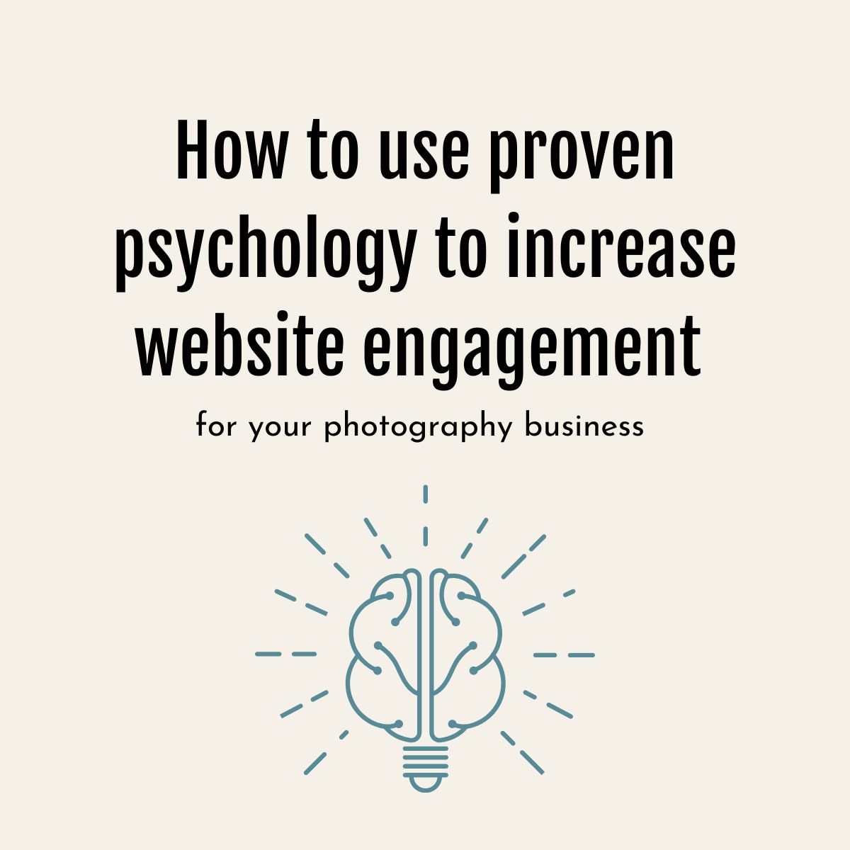
How to use proven psychology to increase website engagement for your photography business
If you’ve ever taken a marketing or design class, you most likely studied the psychology behind various design elements.
Learning the science behind the artistic choices we make, can be an amazing “ah ha!” moment for most creatives.
For many artists, our color and style choices come more from instinct than what we’ve learned in a book. You know the warm colors in your art bring a more exciting and fiery edge without needing scientific studies to confirm it.
But what if I can offer you a cheat sheet that will allow the artist you are to easily implement the science behind your choices and optimize your website?
Here are some design tips based on tried and true marketing and psychology studies which will help you get the most out of your website:
Connectivity
Just like the other aspects of your website, the #1 goal of your design is to make a connection.
This doesn’t mean using the color blue just because it’s a common favorite color.
Instead, do your best to use your resources to elicit an emotional reaction.
Let’s say you have 2 similar photographs you are thinking of using on your wedding photography homepage.
One is stylistically perfect. The light… the angles… everything!
The other is great but not quite as perfect from a purely technical standpoint. The reason you’re even considering it? You managed to get the groom’s very first look at the bride and his expression of awe and love makes everyone go “awwww” as soon as they see it.
Always go with the 2nd.
Once emotions are involved, there is no longer anyone who can compete with you.
Every bride looking at your page is going to want an “awwww” moment of their own and will be convinced you are the best photographer to give it to them.
The same logic goes with the wording you use throughout.
Which is going to make more of an impact on a potential client?
Nashville wedding photographer
or
Guiding you to a different kind of wedding day that’s as adventurous as you are
Spell out exactly how you will give them what they are looking for.
It’s how you can tell a client, “Hey! Want to make sure all the significant, emotional moments are caught on camera for you to look back on forever? You need me!!!”
Remember your goal is always to show how you can help your potential client get their desired results and make yourself their guide in the process.
Stumped on what to write? You can read more about creating a great headline or brand statement here.
Color
I don’t think I need to tell you just how important your color choices can be, but it goes beyond black and white for serious and colorful for casual and fun.
There’s an entire color wheel at your disposal. Make sure you make the most of it.
If you hang out at my website long enough, you’ll notice I’ve gravitated mostly towards a muted green and blue throughout. I doubt you’re going “Oh! I feel so relaxed all of a sudden”, but if questioned, you would probably say my site was calm and that you weren’t distracted.
It’s also very likely you would immediately notice if you left my page and were transferred to another.
Choosing a color profile and making it your “brand” is an easy way to create an impression on a viewer. Visit often enough and I’m sure you will begin to associate the combination of those colors with me whether you realize it or not.
Now here is something else to consider. You see that teal blue? When I first started my company I naturally went to what attracted me most and used pink instead. While it looked great, I later realized I had unintentionally made my website look more feminine than intended. This may have turned off some potential male clients who assumed my preferred clientele was only women.
Learn from my mistake.
While color choice is usually a little more sophisticated than ‘pink is for girls and blue is for boys’, it’s a good idea to have others look at what you have in mind and make sure their impression coincides with your desired result.

Choices
It’s not always ‘the more the merrier.’
In fact, more often than not, too many choices can be overwhelming and can result in a lost sale.
As consumers, it’s not uncommon to get paralyzed by indecision when given what seems like a sea of limitless options.
“How do I know if I’m picking the right one?”…
“What’s the difference between option A and option B?”…
“Which one is the better deal or fits my needs best?!?!?!?”
In our attempt to capture everyone and make sure there’s an option that fits, we have actually made it impossible for them to confidently pull the trigger.
Instead, limit the options and make them easy to sort through.
For example:

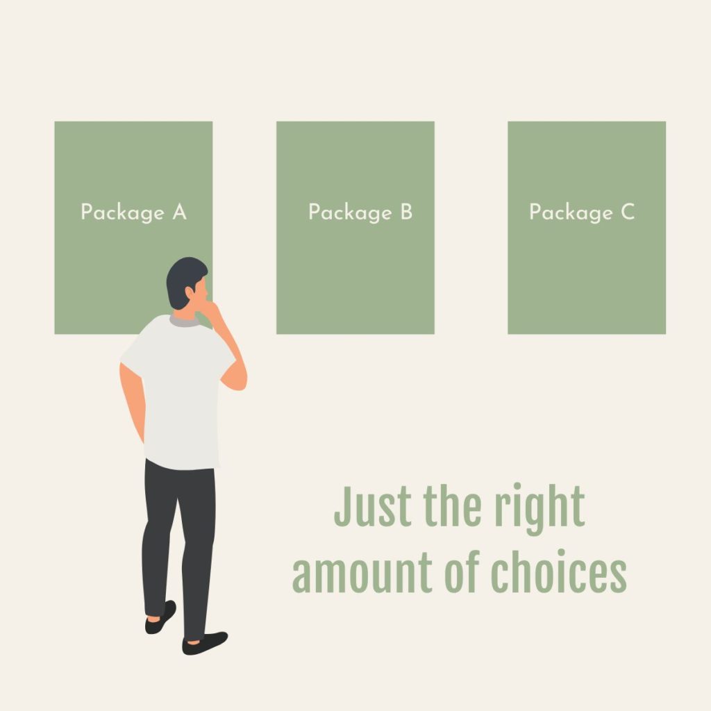
If a client is already convinced you’re the right fit, with option 2 there’s nothing here that would stop them from making a quick decision – leading to a closed sale.
Think “Less is more.”
Order
Humans naturally find comfort in order.
Because of this, our brain often finds ways to create it whenever possible.
Which picture is more attractive to you?

or

This is known as the Gestalt principle of symmetry and order.
There’s just something about that 1st image, and the complete disorder in it, which makes it jarring and unappealing to viewers.
So how do you apply this knowledge to your website?
Make symmetry (and asymmetry!) your friend.
While you want to do what you can to make your site as organized and comfortable as possible, you can actually use the discomfort of asymmetry to make an impact where you need it most.
I love using it for my ‘act now’ buttons. There’s just something about that little jolt of awareness the asymmetry creates in a well-ordered website. It constantly channels a viewer’s attention towards the ‘act now’ and nudges them to push the button.
_________________
Remember, your main goal is to get the sale and having a well thought out and easy to use website is a top way to achieve it.
By applying some basic psychological principles along with a great website design, you are giving yourself a strong, additional tool to convert any potential client into a sale.
Want to make sure you are working with all the best tools available? Reach out now!

Enter your name and email address and viola - you'll have your guide on how to improve your SEO with backlinks! Includes 150 free places to acquire backlinks.
")
