Resources for photographers
Hi. I'm Linnae Harris, web designer & photographer. I help photographers make magnetic websites that attract their ideal peeps.
How to create great service pages for your photography website
You’ve done it.
After countless hours and endless research, you finally created a website you feel good about.
You’re now online for the world to see, but the silence is deafening…. 🙁
What happened?! How can you tell if your photography service pages are working for you?
Easy – Just count the number of new clients and sales generated.
No new clients? Then the hard work you put into creating your new website was probably for nothing. Ouch!
Unfortunately, good looks only get you so far. Without the RIGHT information on your service pages, it’s virtually impossible to make the connection with visitors needed to make a sale.
If I’m being honest, this is the entire reason I have a job.
It’s very easy to look at a successful competitor’s website and think, “I could totally do that on my own!”
Yes, you could superficially build a site which looks good on the surface, however, without the marketing and strategy behind it, your website likely won’t make the impact you are looking for – even if you’re using a template.
How many photography service pages should you have on your website?
What is the MAIN service (genre) you want to be known for? This should be your primary service you focus on with your home page. You can also make an individual service page for this type of shoot but don’t use the same keywords that you used on your home page. Google doesn’t like this!
I would suggest creating a separate page for each of the services or niches that you photograph. There’s several benefits to this. First, your ideal client might be different for each service and this way you can speak directly to them rather than having to be general and not really dialing in your copy for your client avatar.
The other main reason why you want a separate page is so you can target the various keywords which will help you SEO efforts. If you want o more info about SEO click here.

So what exactly should you include in your photography service pages?
Solve your client’s problem
The #1 job of your website should be to form a connection with your preferred client which ends in a sale.
Pictures are great, but without the needed content, your services pages just won’t make the effective impact you need
At this point, you should already have a brand story created for your website and homepage (if not, read about how to create one here and here).
By extending your brand story to your service pages, you are once again able to identify your client’s problem and offer them the perfect solution (you!).
Remember, each page of your website should compliment the others and your brand message should be carried throughout to make the greatest impact.
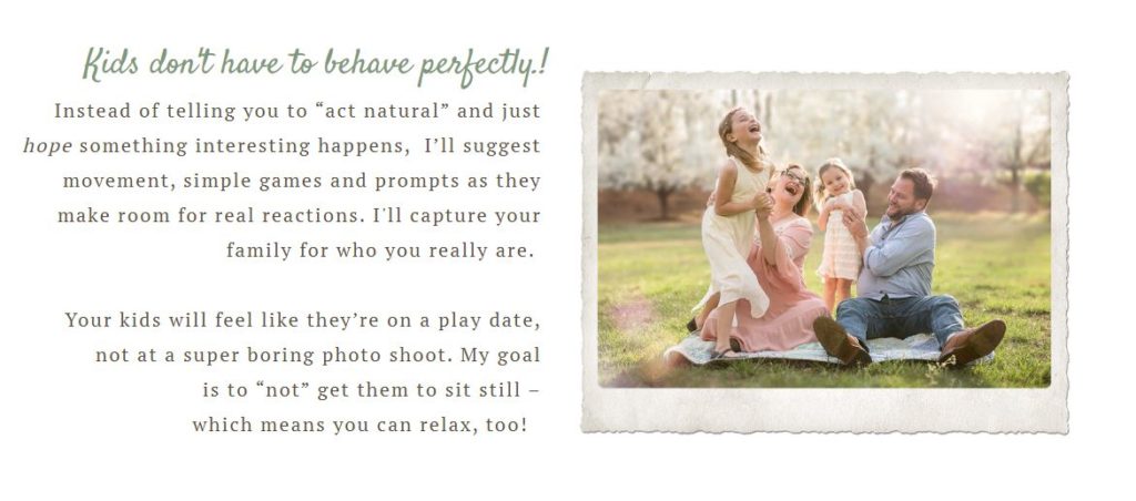
For example, as a family photographer, I used a lot of movement and play during my sessions. On my family service page, I gave a brief explanation as to how this allowed a family to have fun together and it created natural interactions for me to photograph.

For one of my newborn photographer clients, her brand story was all about pampering the parents, especially mom. She listed several ways that she did this to further enforce her idea that “all they had to do was show up”.

How can you use your core brand messaging on you photography service pages?
What photo session info should you include?
You want to find the balance between providing details, without overwhelming them. What aspects of your session experience are unique, support your brand messaging or are important for the client to know about when making a decision about who to hire?
Get them excited about the experience. Some people might feel nervous about being in front of the camera or it may feel like its too much work to set up so instead show them all the positive and fun aspects about doing a session with you.
If you plan to list out what’s included with your session, a bulleted list works great.

Should you post prices on your service page for your photography website?
Don’t make your prices a “surprise!”
While I can’t say it’s the way to go 100% of the time, I do feel posting your “starting at” or “average spend” prices makes sense for the majority of my clients.
I often speak about “not chasing clients” and branding your business to your “dream client” and this goes hand-in-hand with that concept.
Realistically, the main reason why most of my clients don’t want to include prices on their page is out of fear of scaring someone off. But are those the clients you really want? How many clients have you possibly lost because they either incorrectly assumed you were out of their budget or didn’t want to go through the hassle or embarrassment of asking for prices?

Just a few photos or a full gallery?
I almost always include a full gallery on the service page that it fits with. I prefer to do this so a potential client can get all the info and see your gorgeous images all on one page. The more you have a person click though your site, the more likely they will get lost or feel overwhelmed. I like to make it easy for them. You can also boost your SEO by labeling each image with a title and alt description.

Let them know the steps
Be upfront with exactly what you expect and what they should expect from you in return when they hire you.
Usually the best way to do this is with a step-by-step list. It may seem obvious to you, but people are often distracted when they are surfing online so make it simple and show them 3-5 steps that will simplify your photo experience.
It could be as basic as:
- Sign up for phone consult
- Fill out a questionnaire
- Photo session outdoors or at my studio
- Choose your favorite images for your album
This eases any stress of the unknown and helps prevent “surprises” all around. Just in case you were wondering, these are the steps you would take to hire me. 🙂

Remind them of what you have done for others
Testimonials. Reviews. Recommendations.
Whatever you want to call them, make sure you include them on your photography service page!
By using the words of previous satisfied clients to rave about how you exceeded their expectations and how happy they are that they chose you, it’s much easier for a potential client to pull the trigger.
Make sure you go through your positive reviews and pick out the ones that best fit the service page you are developing. It’s actually a huge peeve of mine when I see a review used that doesn’t match the service page you are on. Don’t put a review for a great newborn/child session on a wedding photography service page (or something similar). It not only looks lazy, but also will likely make a client wonder if you are a better child photographer than a wedding one. It’s important to choose accordingly.

Make it easy for them to hire you
Don’t be skimpy on buttons and/or links that can connect them to where they need to go to book a session and hire you.
It’s always amazing to me how certain sites will go to great lengths trying to convince a client to hire them, but when they get to the end of the page there’s no obvious place to go.
All that work down the drain.
Make sure a client is always an easy, and highly visible, click away from a completed sale.
Feeling overwhelmed or like you just don’t have the time to figure all this out? It’s a good thing you have easy access to someone who knows exactly how to help! Reach out now and together we can create a personalized website that will work for you and help you land the quality clients you’re looking for.


Enter your name and email address and viola - you'll have your guide on how to improve your SEO with backlinks! Includes 150 free places to acquire backlinks.