
Resources for photographers
Hi. I'm Linnae Harris, web designer & photographer. I help photographers make magnetic websites that attract their ideal peeps.

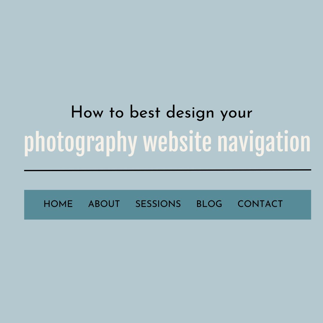
Best design for your photography website navigation
You’ve got the photos, the copy and the design all set for your website.
So you’re done, right?
Not so fast!
Just think…you can have the best-decorated house on the market, but if the layout makes it impossible to find your way around, who cares?!
When a prospective client comes to your website they already have their own internal list of questions- so making sure they can easily get the answers they need must be a key factor in your design.
As artists, photographers have this instinctive need to get creative and try to do things just a little differently, believing it will have a greater impact and stand apart from the crowd.
This is not the time.
When it comes to your photography website navigation, Familiarity Is Your Friend.
Familiarity equals ease. No one wants to go on an extended search to find the information they’re looking for. There’s a reason why certain navigation rules exist and you are only going to put yourself at a disadvantage by trying to reinvent the wheel.
The best photography website navigation is designed to keep the user in mind and make things as easy as possible for them.
These are the essential things you need to consider as you construct the navigation for your website:
Where to put your photography navigation menu
There are two options:
- Top and Horizontal
- Left and Vertical
Top and Horizontal

This is the most common navigation menu option and is usually the way you want to go if your design is on the more formal or more business end of the spectrum.
(+) Most websites use it so it’s the most familiar
(+) Easier to fit into your space and design
(-) Takes up prime real estate on your website
(-) Space is limited so you have to be more concise
(-) You might need drop down submenus
Left and Vertical

Also known as sidebar, this menu can be more difficult to fit in your design but is often a favorite for those wanting something just a little different or requiring more space.
(+) Submenus can be listed without a drop down
(+) You have more usable space at the “top of the fold”
(+) Easy to add new links without worrying about your design
(-) Some people don’t like to use it
(-) Takes up a lot more space
Whichever one you choose, keep in mind that you must be consistent. Love the idea of a vertical menu but know it just won’t work for your about me page? You may need to reconsider things.
Once a viewer knows where to expect to see your navigation menu, one of the worst things you can do is move it on them.
Pick a style and plan to use it throughout.
What to say
In short, keep it familiar and consistent.
Just like its location, the navigation menu should have the same links and wording on each and every page.
What words to use on your photography website navigation
There are certain subpages everyone expects to see.
These are:
- Home
- About or About me
- Contact
- Session info or your genres
- Gallery or Galleries or Portfolio
Again, don’t be creative. If someone is on your site and just wants to find your contact information, it’s very likely they’re just doing a quick word search where they would expect the contact link to be.
Let’s say you try to get a little creative and put “Reach out here” instead of the standard “Contact” button.
Someone could probably deduce “reach out here” was just another phrase used instead of “contact’”. However, when they’re just skimming, it’s not unusual to miss it, leaving the visitor annoyed.

The same logic applies for your other pages as well.
Remember, in website navigation no one is going to reward you for thinking outside of the box.
Here, habit and predictability are your friend.
So is simplicity.
Do your best to keep each menu option as short as possible. Single word options are ideal.
This helps keep your menu clean and familiar.
What order to put them in
English speakers naturally read from left to right and will almost always look top & left first.
Because of this, you will want to put your links in their order of importance from left to right with the exception being your home and contact page. Your viewers will expect those links to be in a certain spot- first and last respectively.
Again, familiarity trumps everything.
How many to use
Not to beat a dead horse but again, simplicity is key.
I usually find 4 to 6 links that fit most photographers’ needs, but not so many that it overwhelms.
A great way to narrow down your options is to choose those that best promote your current goals and will most likely result in a visitor taking action.
Still have too many? Then it probably means you have become overly specific and may need to choose a broader description.
This is where a drop down menu can help.

It allows you to pick a broad label for your menu, but still have easy access to specific links you may need.
While I don’t recommend the excessive use of drop down menus, there are definitely times where it’s the way to go.
A perfect example is your gallery link. While it would be excessive to list every type of shoot or style you do on your menu, it would be perfectly natural to divide your galleries accordingly.
Having a drop down menu under galleries that can help a potential client directly reach the style they’re looking to hire you for can be a huge boon- and it’s completely natural for them to navigate there from the main gallery link.
Remember, your goal is to get your clients the information they need as easily as possible.
Your photography website navigation should be as efficient and familiar as possible.
Having someone who can help create a clear design and navigation will ensure you have a website that puts your very best foot forward and helps you stand out in the crowd. Need help with this? Showit users, you can hire me by the hour, half day or full day. MORE INFO

Enter your name and email address and viola - you'll have your guide on how to improve your SEO with backlinks! Includes 150 free places to acquire backlinks.
")
