Resources for photographers
Hi. I'm Linnae Harris, web designer & photographer. I help photographers make magnetic websites that attract their ideal peeps.
How to create a high converting website
Websites are a lot like puzzles. You may wonder how this ties in with creating a high converting website….
If the pieces don’t fit right, there’s no way to get the full picture.
The entire purpose of a website is to convert visits into bookings and without all the pieces fitting together properly, you are missing a key way to transform potential clients into paying ones.
Don’t have a puzzle with a missing piece.
Follow along to help ensure you have everything needed to have your website reach its full potential.
Find and develop your brand story. This will help to create a high converting website
Of all the steps, this may be the most important.
Your brand story is the common thread which should be weaved throughout your website. Without one, you are missing the backbone that everything else needs to thrive.
Having a good photography brand statement is how you let your clients know what separates you from your competition.
A good brand story should tell a client: the type of photographer you are, which clients you are perfect for, and exactly how you differ from your competition. Read more about how to create a brand statement HERE and “How to create a compelling brand story” HERE.
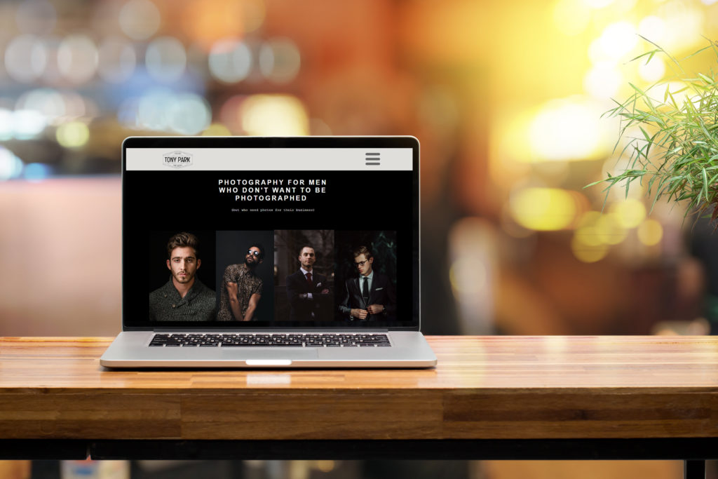
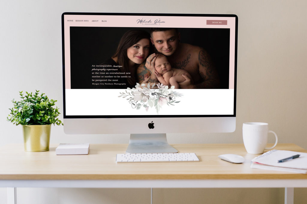
Don’t be afraid to be specific! Below are a few of my website client’s sites that I designed. See how we used a brand statement in the hero section?


When trying to sell ourselves, it’s not unusual to worry about accidentally scaring someone off or missing a sale.
Get that mindset out of your head!
Never lose sight of the fact that your website isn’t meant to convert everyone. You don’t want your website to convert every one – just your ideal client.
Not only is that impossible, it would also almost guarantee you would end up working with people who aren’t the right fit- something to avoid no matter which side of the camera you’re on!
For a more in-depth guide as to how to create the best brand story for your business look here.
Once you have your brand story, you need to make sure you use it throughout your page.
If you are selling yourself as the perfect family photographer for those wanting a fun, casual experience, make sure you touch back to that (and don’t contradict it!) whenever you can.
I once had a client go on and on about how great she was about making sure kids were happy and smiling throughout her sessions but then she wanted to post predominately black and white photos with serious expressions throughout.
Not exactly the cohesive brand statement we were looking for.
Once we sat down and I had her put together a list of qualities she was looking for in a dream client and the pictures she felt best represented her style, we quickly realized she actually gravitated towards families with older kids seeking a more high end and formal session.
Narrowing down and finding the brand story which truly best represented her, and not just what she thought would sell the best, ended up becoming a game changer and both her profit and level of satisfaction rose considerably.
Consistency is key and you want to be sure that no matter which page a client visits, your message is coming across loud and clear!
This leads us to…
Make sure your website is easy to navigate as it helps to create a high converting website
There is no need to reinvent the wheel (and you honestly shouldn’t).
Clever names and headings, cute icons instead of headers for links, and similar “creative” ideas are a huge “NO!”
Remember, the point isn’t to show how clever you are.
Your #1 goal should always be to make it easy for your dream client to navigate your website and hire you.
Ensure you have the subpages clients expect and that they are easy to find.
My usual musts for subpages are:
- Homepage
- About Me (But remember it’s actually about how you can help them!)
- Service pages with appropriate text and portfolio
- Your contact page
- Blog
If you’d like to get a more in depth idea of what you should include in each subpage just click the links above.
Don’t forget about SEO.
When writing, it can be easy to get lost in the story you want to tell and forget about those little words and phrases you need to include to help ensure your website shows up on top of Google.
Stay focused!
SEO (Search Engine Optimization) is basically your website’s version of handing your business card out to anyone looking for a photographer in your area. Learn more about SEO and get 150 places for photographers to get backlinks HERE.
By using the right words and phrases on your website (and blog!), you ensure yourself a top spot and the best chance to get a potential client’s attention.
Another thing to consider is the number and quality of the pictures you decide to use on your site.
I highly recommend the less is more strategy for a couple reasons.
The first, is one I see covered often. Too much selection numbs the person looking at it. A few great pictures wows, but a seemingly endless gallery quickly loses impact on the viewer.
Another is less obvious.
Space and loading time.
How often have you pulled up a website only to find that none of the pictures will load or take forever to load? If you are like me, you may try and reload it one more time but after that you quickly move on. Don’t risk getting punished because someone has a bad signal or connection. Google likes fast loading websites. Read article about this topic HERE.
Another way to create a high converting website is to use a landing and sales pages
Think of landing and sales pages as your website’s version of placing a quick one page ad in the paper or displaying a flier on the wall of a busy coffee shop.
Your main website is there to build a relationship and lead a potential client on a journey to discover who you are and how you can help them.
A landing or sales page is the quick, one-stop spot that is meant to accomplish one specific set goal.
The biggest difference between the two is actually right in their names.
Landing pages are meant to “land” information like names, emails, and phone numbers from potential clients to help generate future leads and sales. Because of this, they need to be clear, concise and have a convincing call to action. They are key if you are trying to gain contacts and build a client base or get clients signed up for your newsletter or blog.
Sales pages are perfect for when you want to sell something specific. Running a mini session and wanting to make it easy for clients to sign up and book a slot? A sales page could be a perfect way to make a quick and easy sale. Remember, this is a quick stand alone page for clients to land on that isn’t meant to sell all you have to offer. Make sure to include information about the product or service you are trying to sell, testimonials from previous happy clients, and a call to action to make it easy for a potential client to book you!
Using both landing and sales pages can help you get the quick results needed for a specific job and also help flesh out your website, giving you another avenue to convert visitors into paying clients.
Feeling overwhelmed? You shouldn’t be. Why? You have a super effective secret weapon- ME!
I offer a variety of packages tailored to giving you the right amount of assistance needed to turn your ho-hum website into the ultra converting website you need. Let’s schedule an appointment to talk today!

Enter your name and email address and viola - you'll have your guide on how to improve your SEO with backlinks! Includes 150 free places to acquire backlinks.